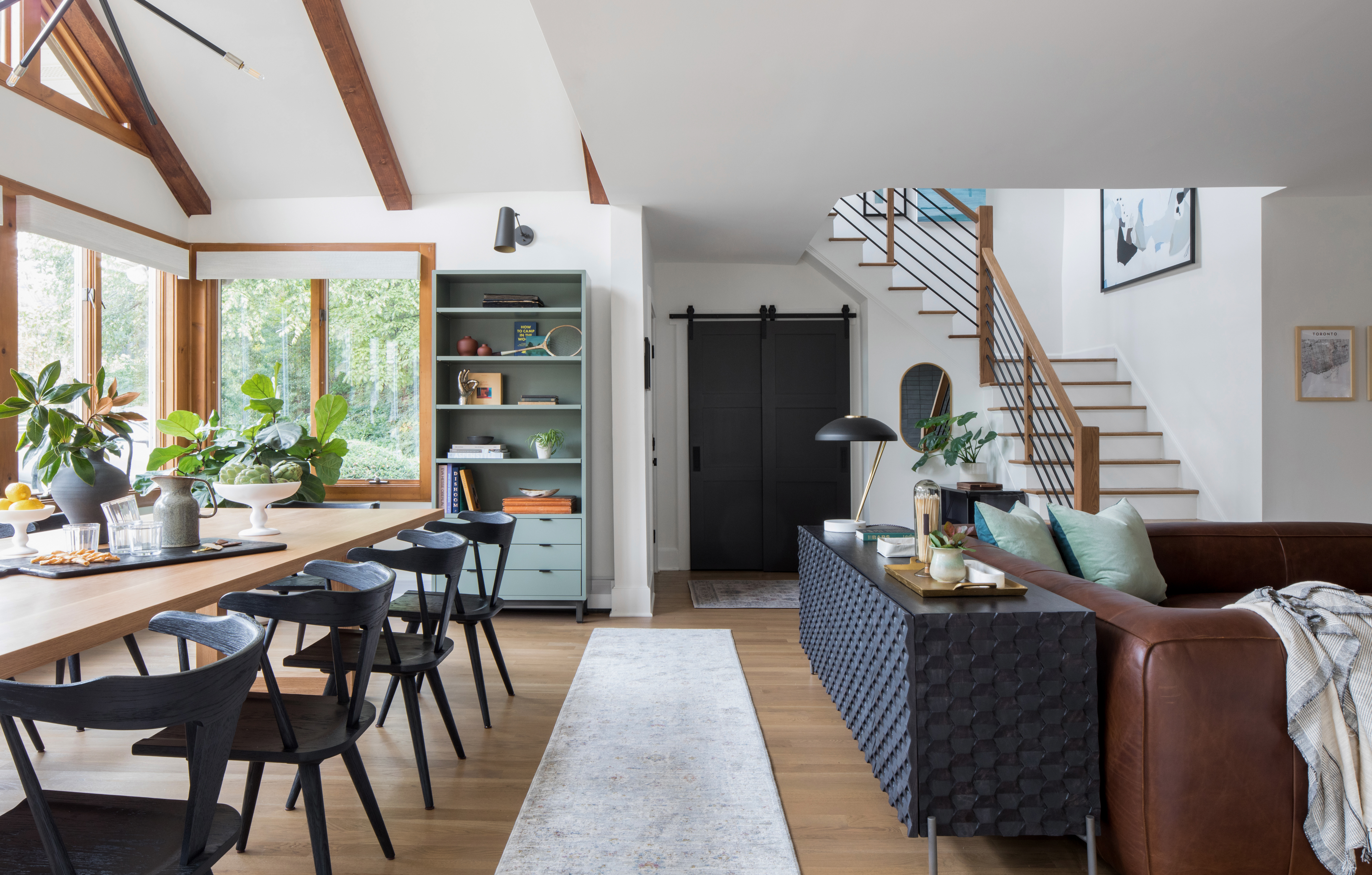
Modern Dining Space Project Reveal
When we first met our lovely clients for this project they had just purchased their new home in the beautiful oceanside town of Atlantic Highlands, NJ. They were in love with the scenery and natural setting. As avid bicyclists and travelers, they envisioned their new home being transformed into a mid-century modern family retreat complete with a modern dining and entertaining space.
When we saw the property in person, we could see that this place was unique. Being poised on a hilltop, through the trees you could see the Hudson Bay and glimpses of the New York City skyline. The dining room had ample windows showcasing the view. However, some of the finishes and details in the space were well worn and loved by the previous owners, and were in need of an update.
They came to us wanting help with furniture and space planning for the large space. They hoped to do more–like refinishing the fireplace and flooring–as time went on. After meeting our clients and walking the space, we could immediately envision this space as something really magical. It just needed new floors, fireplace, staircase, ceiling beams, lighting, a couple new doors, and some paint.
To help our clients see the possibilities, we presented 3D renderings and design plans and explained that hiring a designer and only letting us do half the job would be like getting half your teeth whitened. It won’t meet your expectations and you won’t be happy in the end. The clients loved our plans and we got the green light to move forward!
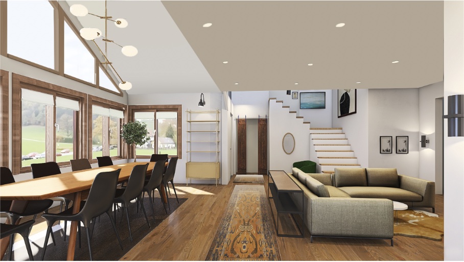 Entry Design
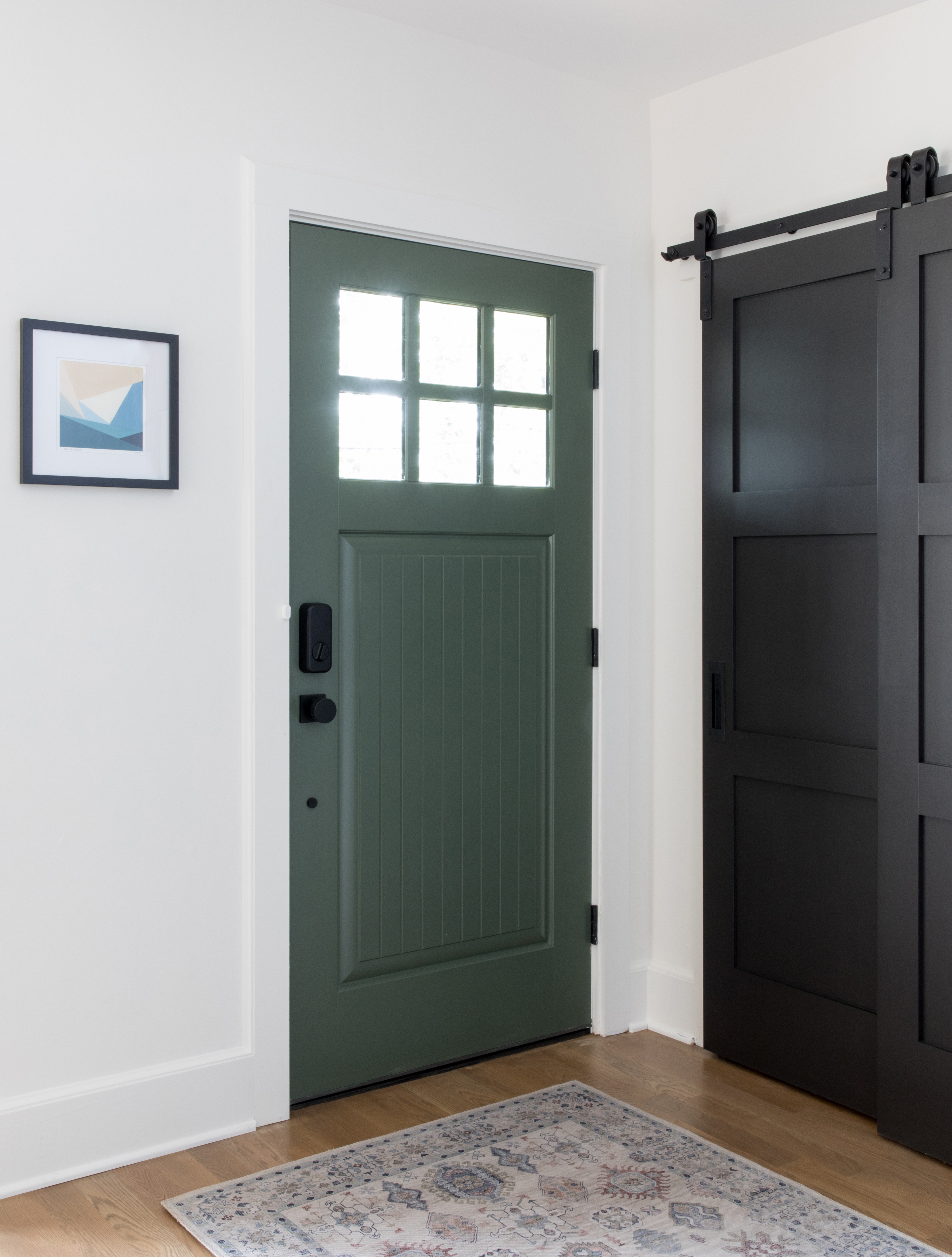
We started working on the staircase designs by providing inspiration images of some different options, we then mocked up the client’s selection using Photoshop so they could envision how their staircase would look in this style. For the entry we also sourced new closet and entry doors. This allowed us to begin introducing the more modern color palette, bringing the outdoors in.
The floors were un-level since the house had an addition and the original structure dates back to the early 1900s. The carpeting was concealing some of the height changes. By ripping up the rug and having the contractors level out the subfloor, they were able to lay the new wood flooring down and create a more level space. We worked with the flooring company to select the white oak flooring and to get the perfect stain mixture to match up with the red oak stairs.
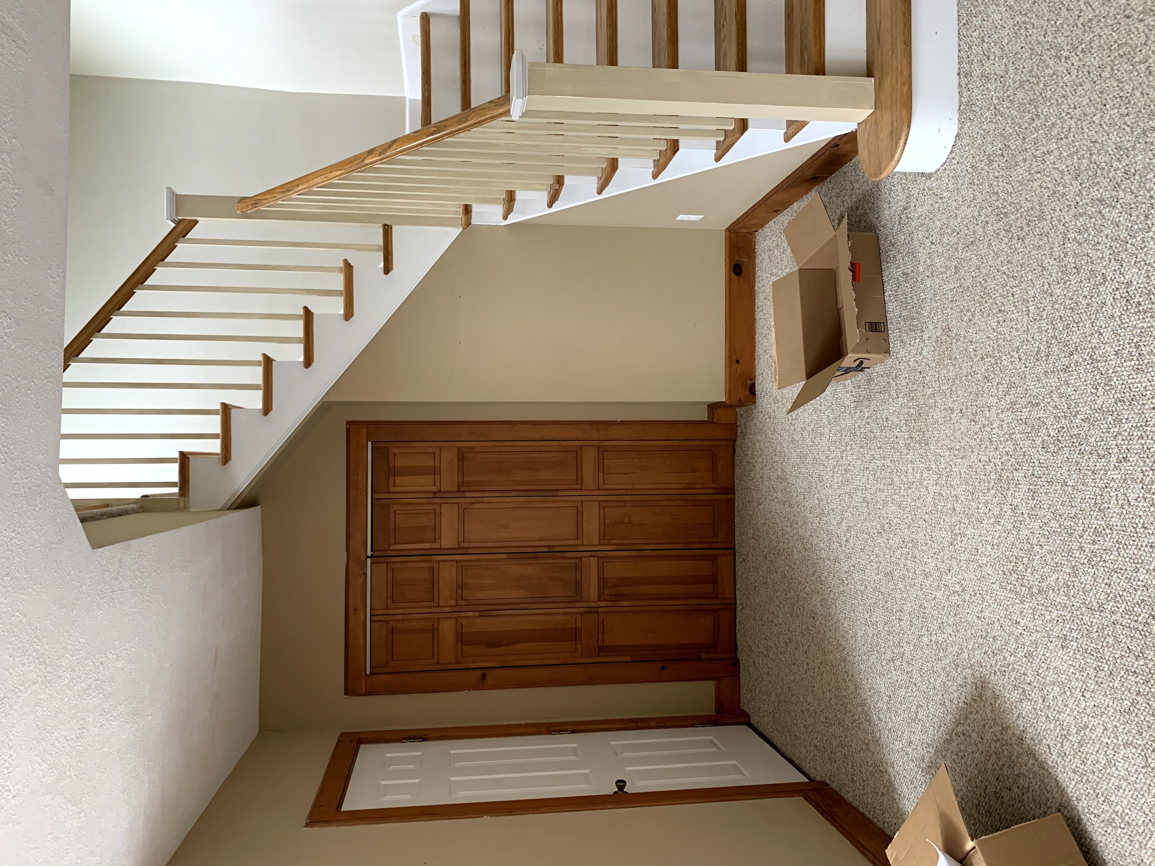
Before
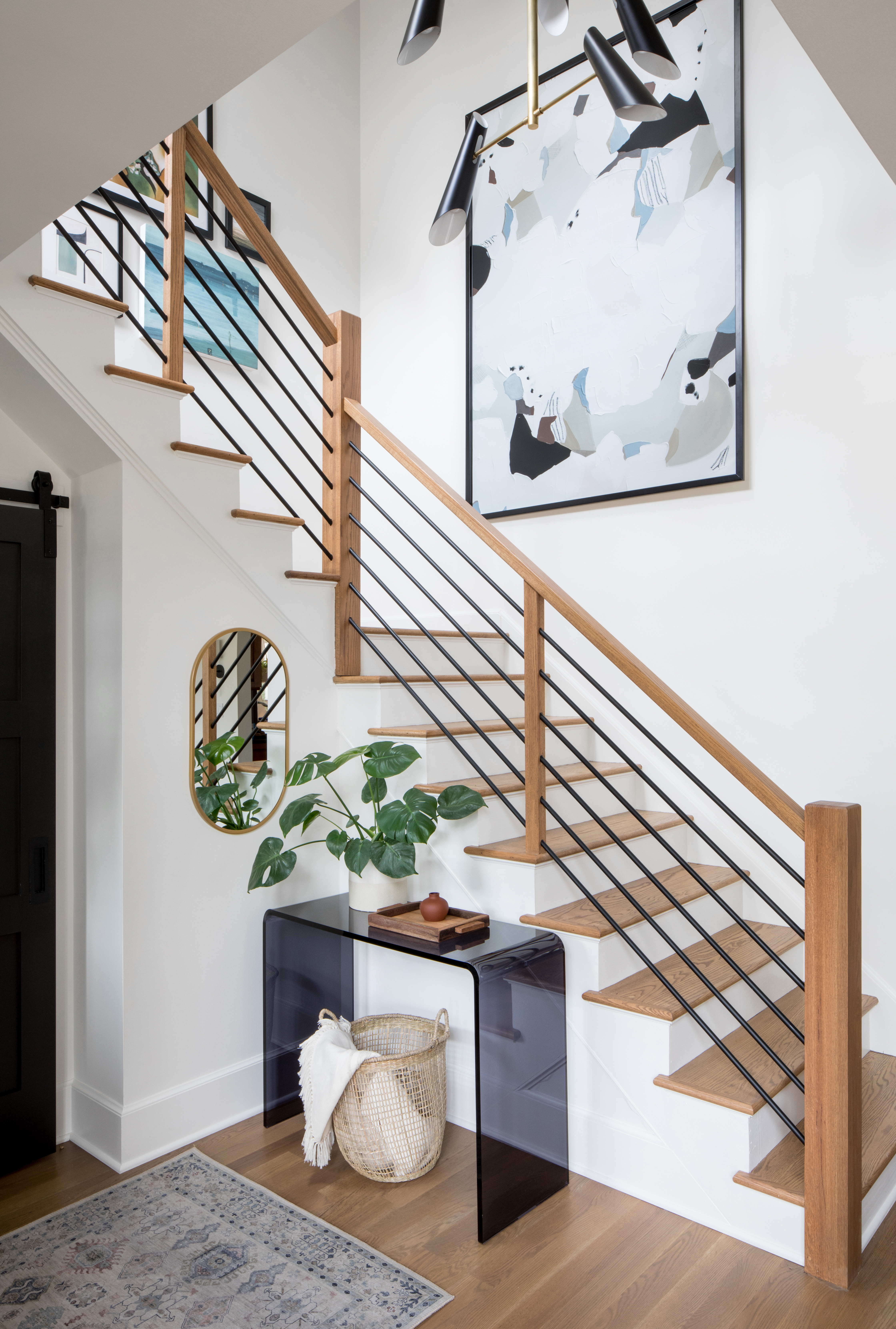
After
After
Creating a Modern Dining Room
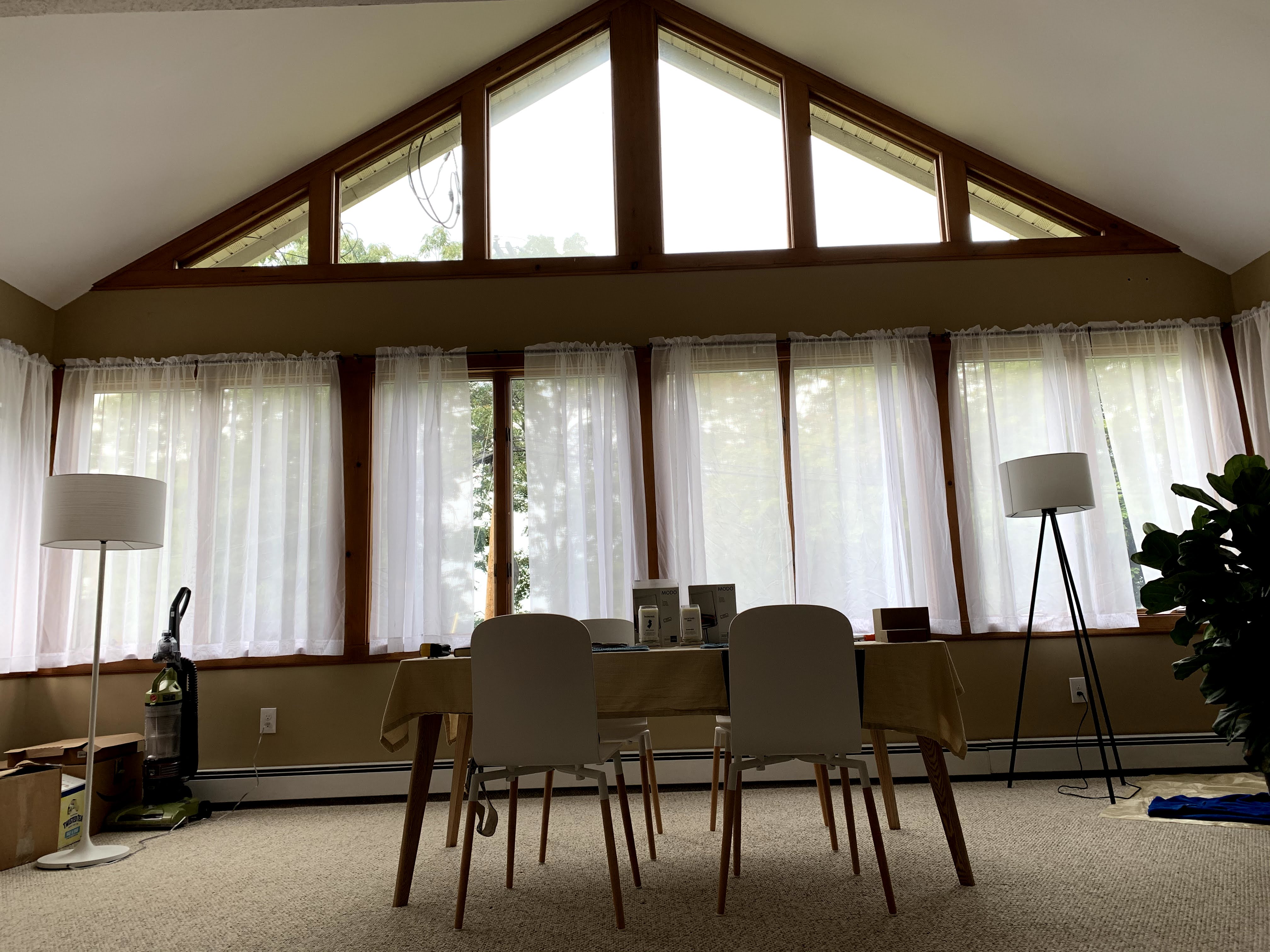
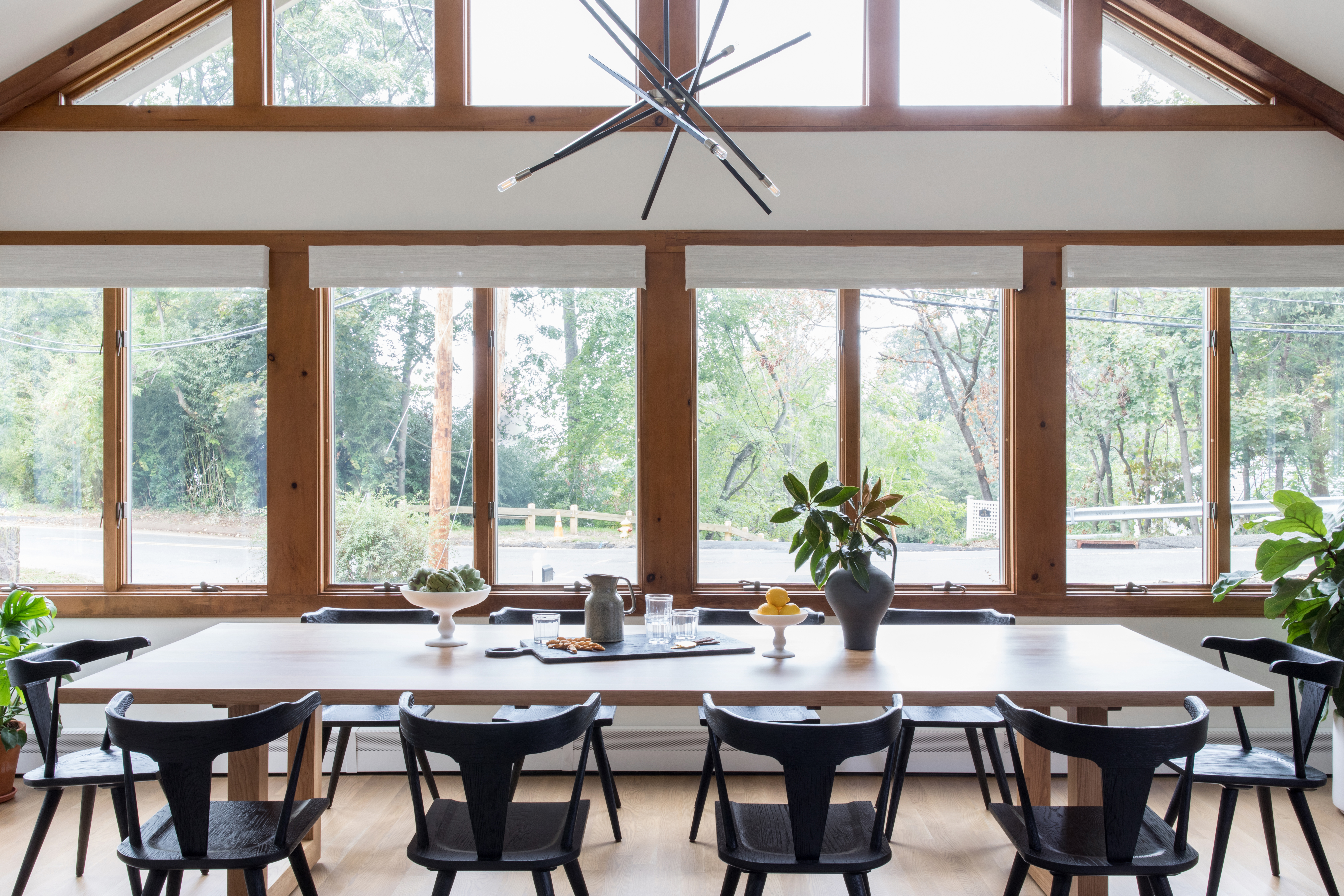
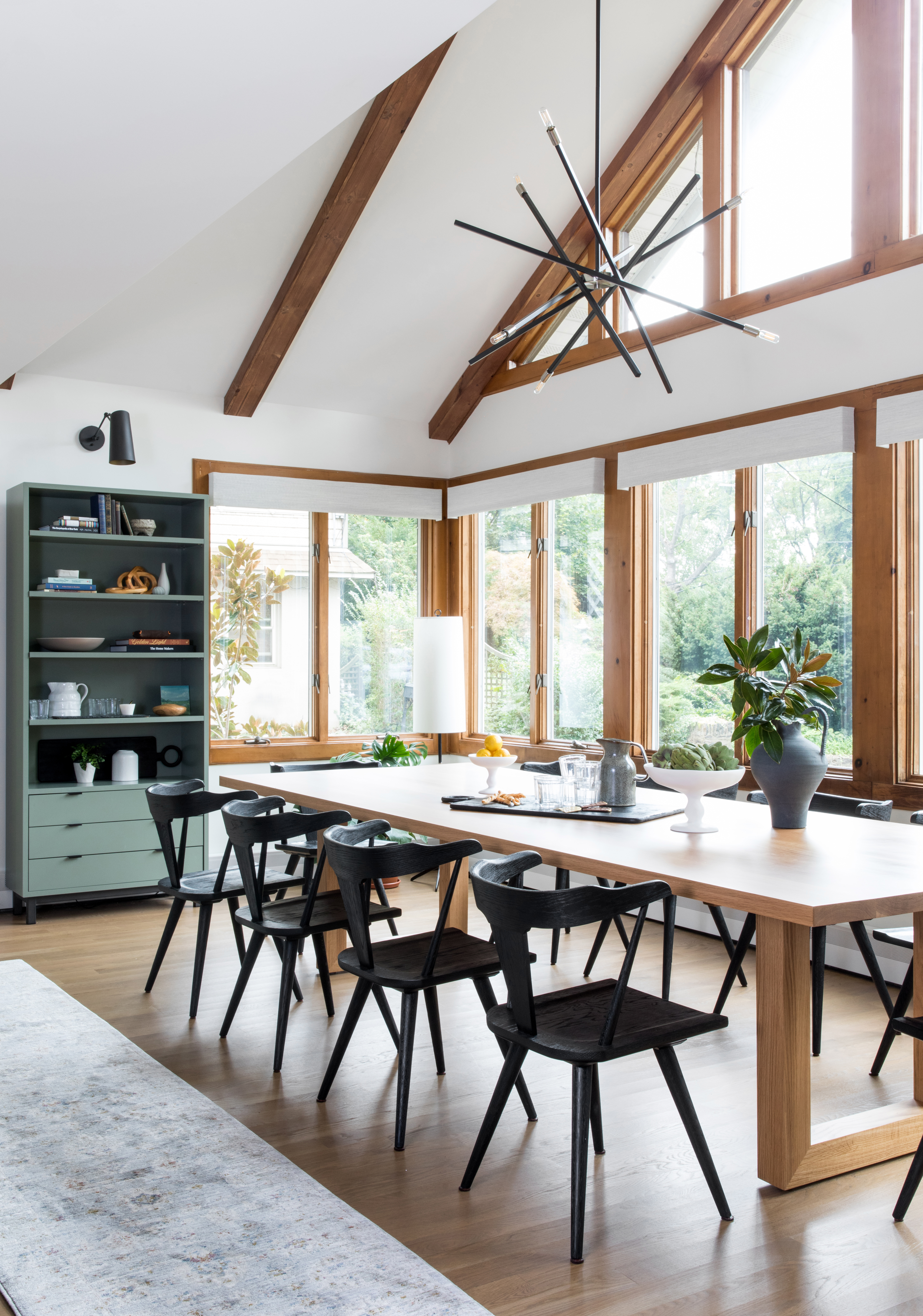
For the dining table, they wanted a space where they could have family come and stay and congregate around a large modern dining table. In looking for a new table, we weren’t finding anything in their style that fit the dimensions of the area. So with their approval, we drew up some designs and had a custom dining table made just for them. It turned out to be absolutely perfect and is framed out so beautifully by all the windows in the space.
Before
After
After
The Fireplace
The fireplace was a facade over the original fireplace from the early 1900s and the sides were not fully trimmed out and covered so we decided to make this have a more minimalist mid-mod look by using a hand crafted brick tile that extended from floor to ceiling. This strong vertical element also aimed to make the ceilings in this area of the space seem higher since they were lower than in the dining room.
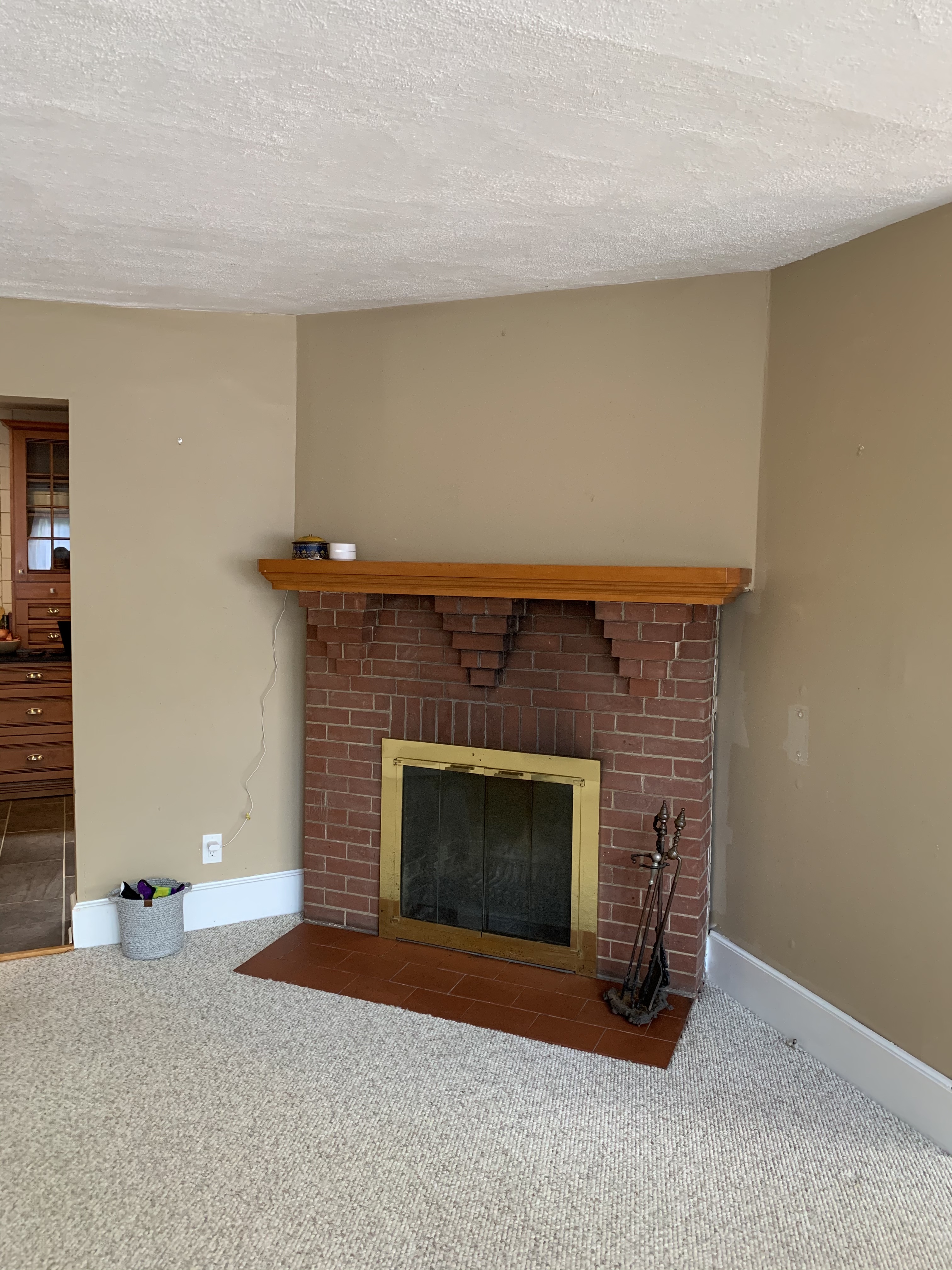
Before
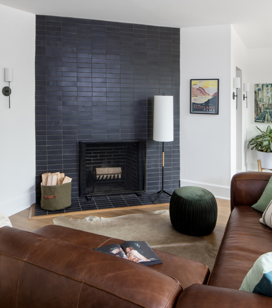
After
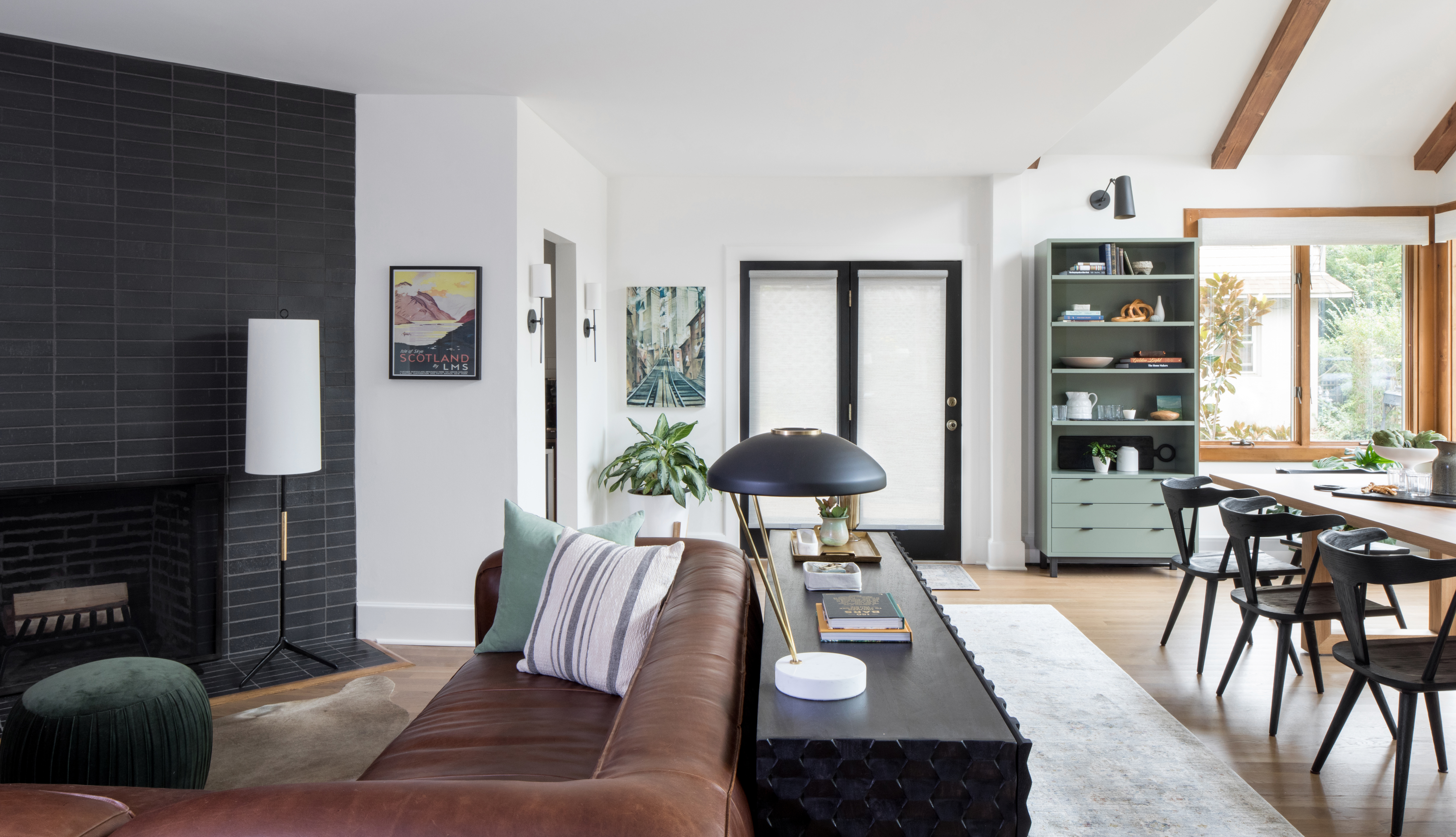
After
The lighting in this space was also a key element. When we first met the clients, there were no recessed lights and they were just using lamps to light this large open space. We added a number of high hats, as well as wall sconces, and chandeliers to fill the space with light on multiple levels and highlight the new layout and furnishings.
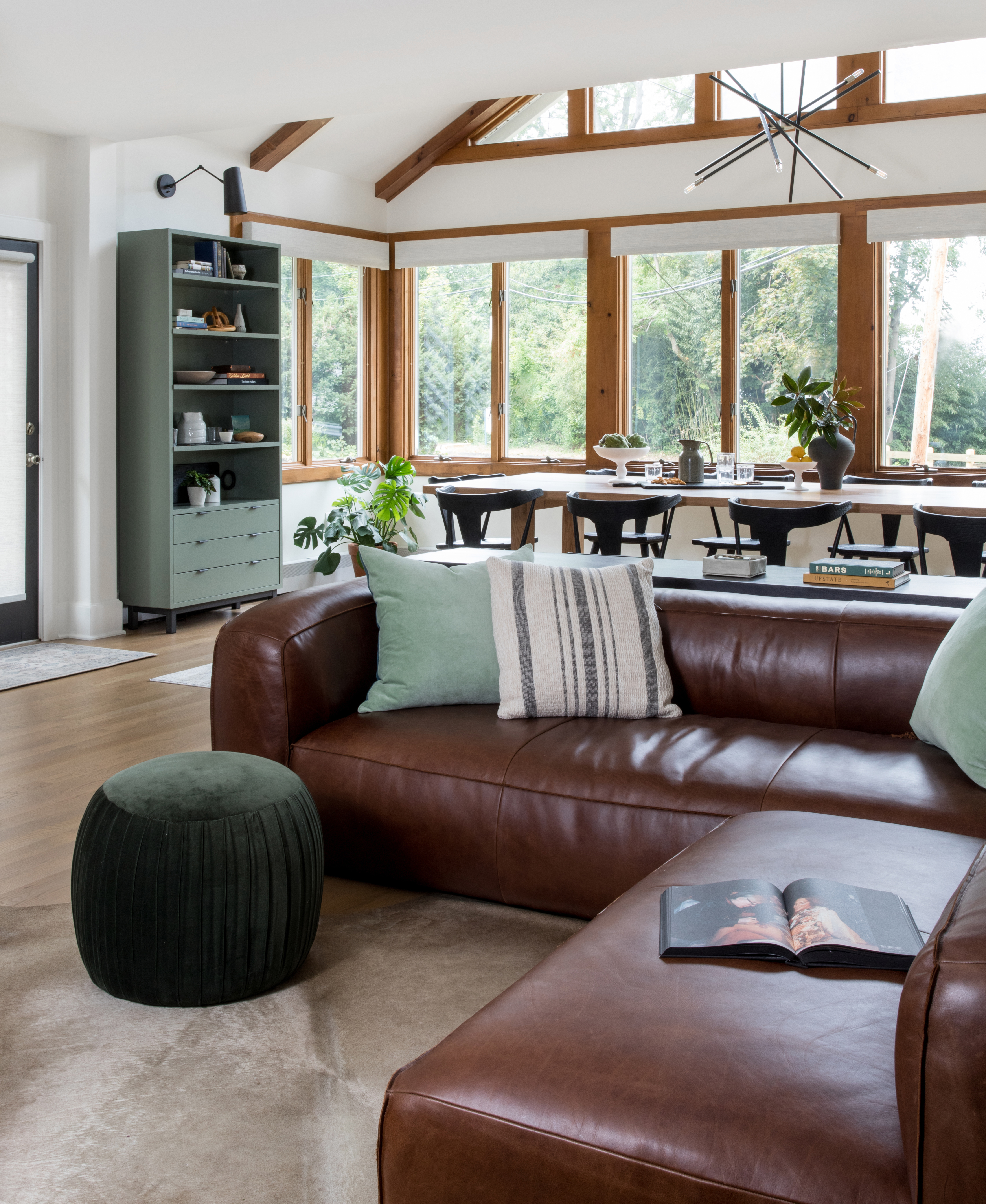
After
Highlighting the Natural Trim
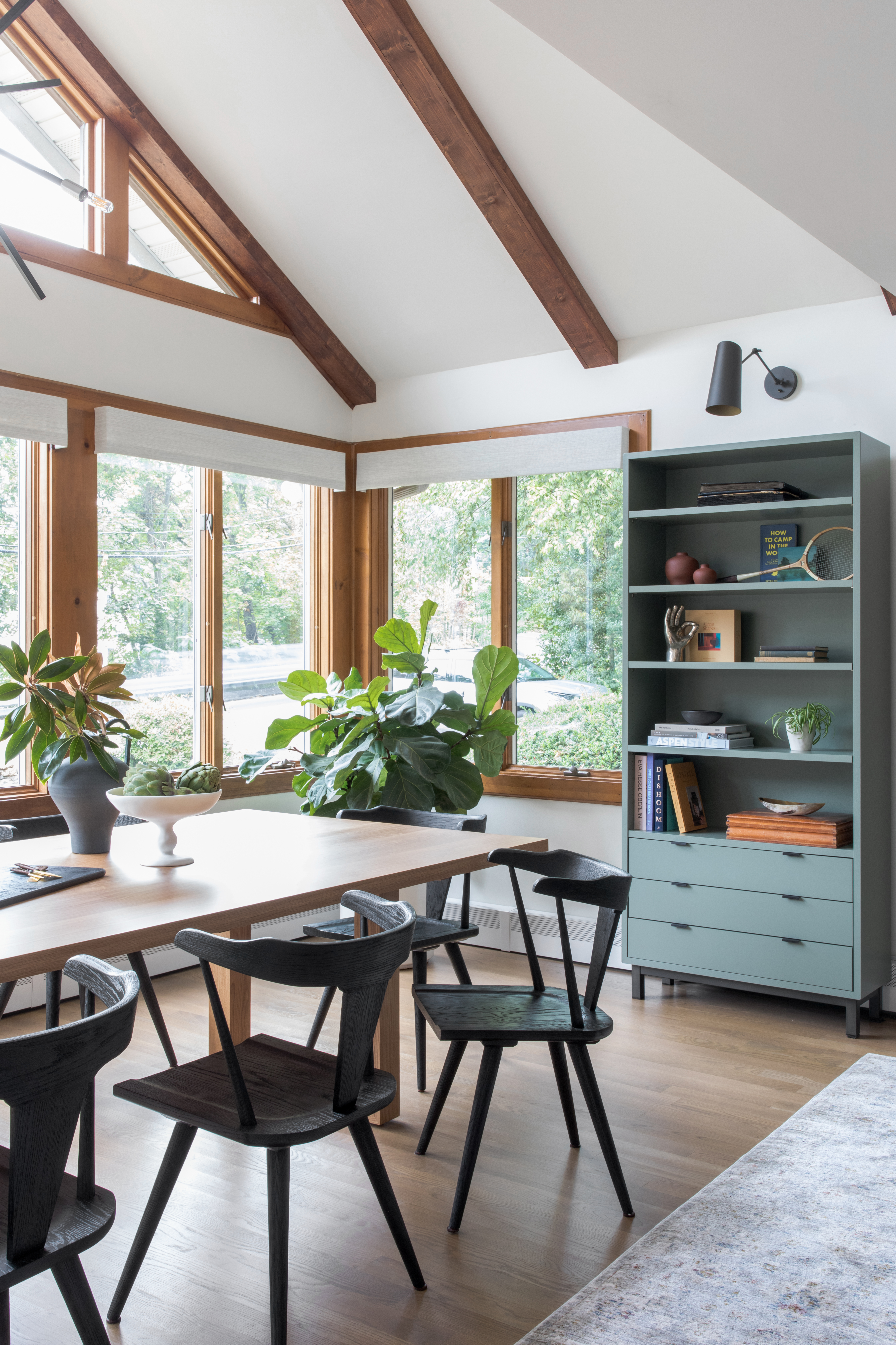
Because they wanted to keep the trim around the windows the original color, we decided to suggest adding a couple beams in a similar color to make the vaulted ceiling in this area more of a focal point and to repeat the same wood toned framing from the windows. The result has such a cozy A-frame retreat in the mountains feel. The final chef’s kiss was styling it to bring in some of their own personal items mixed with neutral modern sculptural pieces and repeating the warm wood textures.
After
This was such a fun project and we loved every minute of working with these clients. We hope you enjoy this transformation as well. Click here to view all the pictures from the project. Feel free to leave a comment or send us an email.


